金字塔图
金字塔图有几种方法/包绘制:
- plotrix 包
- DescTools 包 PlotPyramid
- ggplot2 包
library(ggplot2)
library(DescTools)
library(plotrix)
使用plotrix包绘制人口金字塔图
=============================
# 构建示例数据
xy.pop<-c(3.2,3.5,3.6,3.6,3.5,3.5,3.9,3.7,3.9,3.5,
            3.2,2.8,2.2,1.8,1.5,1.3,0.7,0.4)
xx.pop<-c(3.2,3.4,3.5,3.5,3.5,3.7,4,3.8,3.9,3.6,3.2,
            2.5,2,1.7,1.5,1.3,1,0.8)
agelabels<-c("0-4","5-9","10-14","15-19","20-24","25-29","30-34",
                "35-39","40-44","45-49","50-54","55-59","60-64",
                "65-69","70-74","75-79","80-44","85+")
mcol<-color.gradient(c(0,0,0.5,1),c(0,0,0.5,1),c(1,1,0.5,1),18)
fcol<-color.gradient(c(1,1,0.5,1),c(0.5,0.5,0.5,1),c(0.5,0.5,0.5,1),18)

# 使用pyramid.plot函数绘制人口金字塔图
par(mar=pyramid.plot(xy.pop,xx.pop,labels=agelabels,
                        main="Australian population pyramid 2002",
                        lxcol=mcol,rxcol=fcol,
                        gap=0.5,show.values=TRUE))
使用DescTools包绘制人金字塔图
=============================
# 准备数据
d.sda <- data.frame(
    kt_x =  c("ZH","BL","ZG","SG","LU","AR","SO","GL","SZ",
            "NW","TG","UR","AI","OW","GR","BE","SH","AG",
            "BS","FR","GE","JU","NE","TI","VD","VS"),
    apo_n = c(18,16,13,11,9,12,11,8,9,8,11,9,7,9,24,19,
            19,20,43,27,41,31,37,62,38,39),
    sda_n = c(235,209,200,169,166,164,162,146,128,127,
            125,121,121,110,48,34,33,0,0,0,0,0,0,0,0,0)
)
head(d.sda)
## kt_x apo_n sda_n
## 1 ZH 18 235
## 2 BL 16 209
## 3 ZG 13 200
## 4 SG 11 169
## 5 LU 9 166
## 6 AR 12 164
# 使用PlotPyramid函数绘制人口金字塔图
PlotPyramid(lx=d.sda[,"apo_n"],   # 左侧值
            rx=d.sda[,"sda_n"],   # 右侧值
            ylab=d.sda$kt_x,      # 纵坐标
            col=c("lightslategray", "orange2"), # 颜色设置
            border = NA, ylab.x=0,
            xlim=c(-110,250),
            gapwidth = NULL,
            cex.lab = 0.8, cex.axis=0.8,
            xaxt = TRUE,
            lxlab="Drugstores",            # 左侧横轴标签
            rxlab="General practitioners", # 右侧横轴标签
            main="Density of general practitioners and drugstores in CH (2010)",
            space=0.5, args.grid=list(lty=1))
op <- par(mfrow=c(1,3))
m.pop<-c(3.2,3.5,3.6,3.6,3.5,3.5,3.9,3.7,3.9,3.5,
            3.2,2.8,2.2,1.8,1.5,1.3,0.7,0.4)
f.pop<-c(3.2,3.4,3.5,3.5,3.5,3.7,4,3.8,3.9,3.6,3.2,
            2.5,2,1.7,1.5,1.3,1,0.8)
age <- c("0-4","5-9","10-14","15-19","20-24","25-29",
            "30-34","35-39","40-44","45-49","50-54",
            "55-59","60-64","65-69","70-74","75-79","80-44","85+")

PlotPyramid(m.pop, f.pop,
            ylab = age, space = 0,
            col = c("lightsteelblue","pink"),
            main="Age distribution at baseline of HELP study",
            lxlab="male", rxlab="female",
            ylab.x = 0
            )
PlotPyramid(m.pop, f.pop,
            ylab = age,
            space = 1, # 设置 bar 之间空隙的大小(0~1)
            col = c("blue", "red"),
            xlim=c(-5,5),
            main="Age distribution at baseline of HELP study",
            lxlab="male", rxlab="female",
            gapwidth=0,
            ylab.x = -5  # 指定纵轴标签位置
) 
PlotPyramid(c(1,3,5,2,0.5), c(2,4,6,1,0),
            ylab = LETTERS[1:5], space = 0.3,
            col = rep(rainbow(5), each=2),
            xlim=c(-10,10), args.grid=NA,
            cex.names=1.5, adj=1,
            lxlab="Group A", rxlab="Group B",
            gapwidth=1, ylab.x=-8, xaxt="n")

par(op)
使用ggplot2包绘制金字塔图
=========================
library(plyr)

# 构建示例数据
mov <-c(23.2,33.5,43.6,33.6,43.5,43.5,43.9,33.7,53.9,43.5,
        43.2,42.8,22.2,51.8,41.5,31.3,60.7,50.4)
mob<-c(13.2,9.4,13.5,13.5,13.5,23.7,8,3.18,3.9,3.16,23.2,
        22.5,22,12.7,12.5,12.3,10,0.8)
fov<-c(13.2,9.4,13.5,13.5,13.5,23.7,8,3.18,3.9,3.16,23.2,
        22.5,22,12.7,12.5,12.3,10,0.8)
fob<-c(23.2,33.5,43.6,33.6,43.5,23.5,33.9,33.7,23.9,43.5,
        18.2,22.8,22.2,31.8,25.5,25.3,31.7,28.4)
labs<-c("uk","scotland","france","ireland","germany","sweden","norway",
        "iceland","portugal","austria","switzerland","australia",
        "new zealand","dubai","south africa","finland","italy","morocco")

df = data.frame(labs=rep(labs,4), values=c(mov, mob, fov, fob),
                sex=rep(c("Male", "Female"), each=2*length(fov)),
                bmi = rep(rep(c("Overweight", "Obese"), each=length(fov)),2))
head(df,2)
## labs values sex bmi
## 1 uk 23.2 Male Overweight
## 2 scotland 33.5 Male Overweight
# 绘制金字塔图
ggplot(df, aes(x=labs)) +
  geom_bar(data=subset(df,sex=="Male"), aes(y=values, fill=bmi), stat="identity") +
  geom_bar(data=subset(df,sex=="Female"), aes(y=-values, fill=bmi), stat="identity") +
  geom_hline(yintercept=0, colour="white", lwd=2) +
  theme_bw()+
  coord_flip(ylim=c(-100,100)) +
  scale_fill_brewer(palette='Set1') +
  scale_y_continuous(breaks=seq(-100,100,50), labels=c(100,50,0,50,100)) +
  labs(y="Percent", x="Country") +
  ggtitle("Female                   Male") +
  theme(plot.title = element_text(hjust = 0.5))
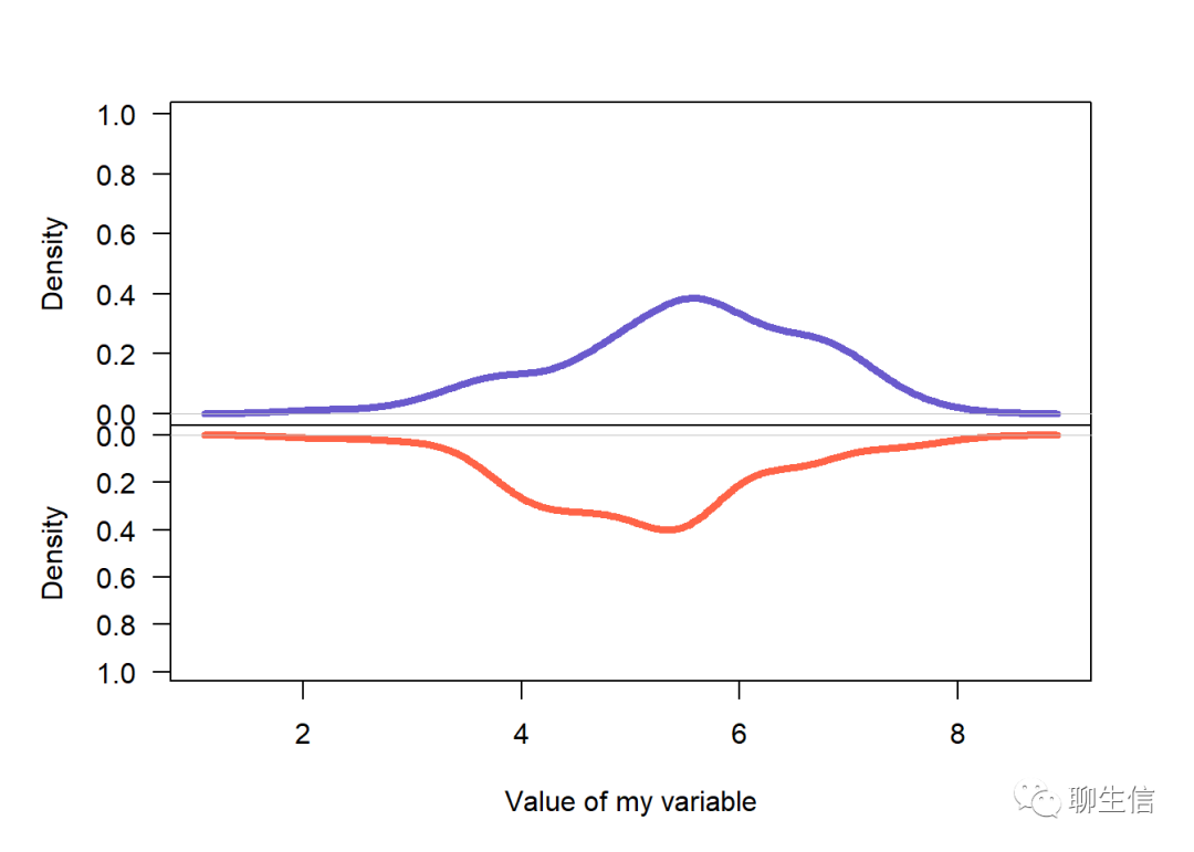
镜面图
资料链接:
R ggplot2 科研数据可视化
源:公众号:生信菜鸟团
用 circlize 包画圈圈图看各染色体上差异基因
library(circlize)
# (zuguang gu)
one of the example
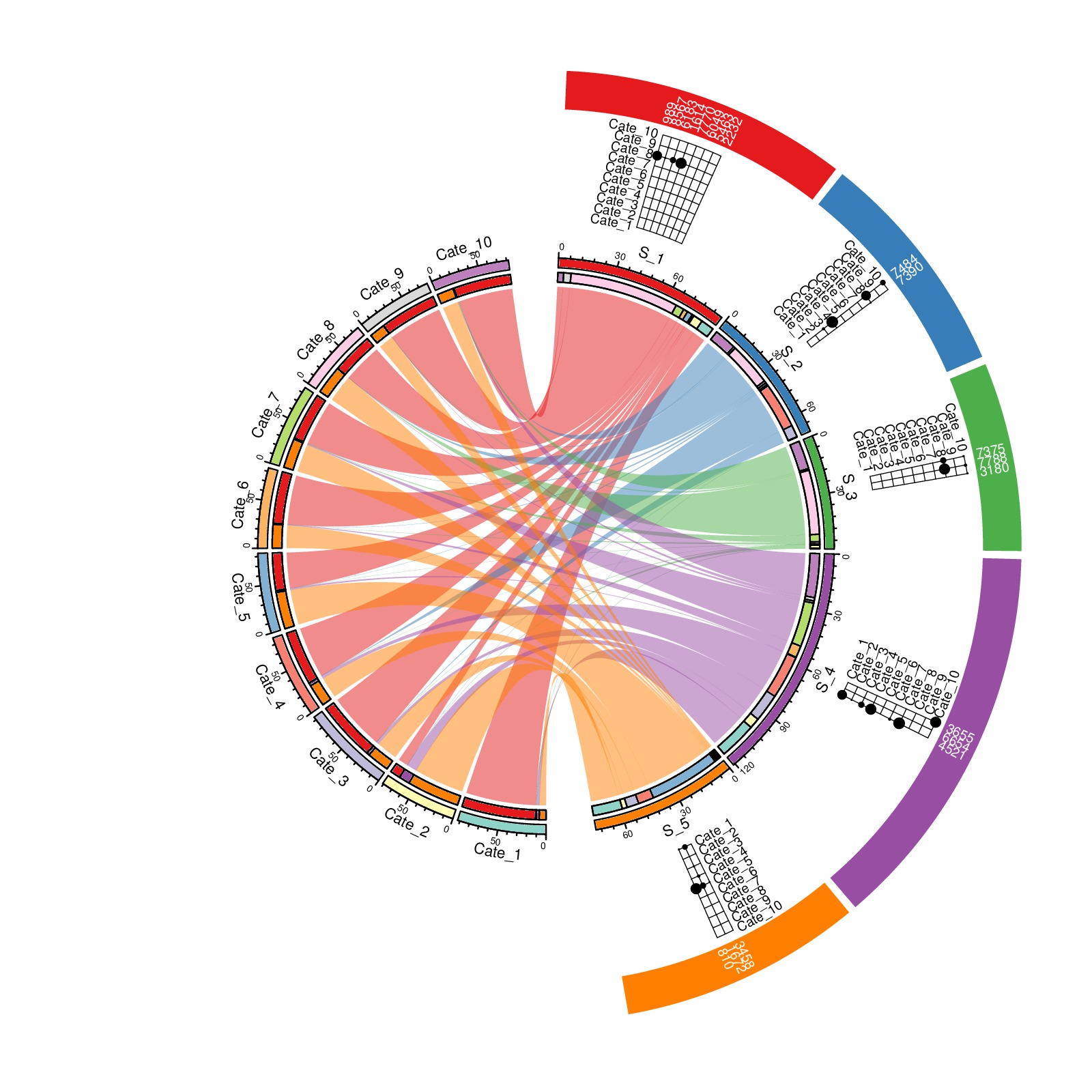
官方 manual:
circlize: circular visualization in R